Matching the Elegance of Vintage Luxury with the Business' Website
My wife and I recently got married and one of the most memorable moments was our send off at the end of a perfect day. Our car we rode away in was a 1964 Austin Vanden Plas Princess Limousine. Brimming with classic, luxurious elegance, it was the icing on the cake for our day.
Luckily, we were recommended the service we used, Something Vintage Something Blue, by our wedding planner. Had she not highly recommended this local business, I'm not sure we would have booked a service with them based on the website alone.
For this project, I set out to redesign the website, bringing it in line to the feeling I had personally and would expect from a luxury chauffeur service.
Defining the Current Shortcomings
A Quick Note
Due to the timeline for this project I was not able to work directly with the owner of Something Vintage Something Blue. My design mentor acted as owner and stakeholder in place of this.
The existing SVSB website lacked a modern, elegant feel that represented the luxury and accessibility of their service. The site was not user-friendly, lacked intuitive navigation, and did not adequately showcase their vintage car offerings. For this redesign I set out to first gather data about competitors, survey existing and potential users of the website, and perform a heuristic evaluation of the current design.
Objectives
Assess the website’s usability by performing an in-depth heuristic evaluation, pinpointing what works, what doesn't, and why.
Conduct a competitive analysis to identify standout features and local industry benchmarks in luxury vehicle chauffeur service websites.
Obtain direct user feedback on the website’s usability and design through user testing.
Questions
What are the primary usability challenges faced by users on the current website?
How does the website’s design and usability compare to both local and leading competitors in the luxury vehicle rental market?
What design elements are competitors using that could enhance the luxury appeal and user experience of the SVSB website?
Participants Expected More From the Website
I conducted unmonitored user testing with 6 participants. Using a survey I created as a testing guide for them, they were tasked with finding pricing and other info, many of the sections having the participants score the ease of use, visual design, and more.


Negative feedback focused on the poor use of color schemes, cluttered layout, and low-quality images. Positive remarks were few but included liking some of the vintage car images displayed.

Participants generally found instructions on how to book unclear, often not realizing initially that booking was only possible via a phone call. The lack of an online booking option was frequently mentioned as a significant drawback.
Overall, the user experience was described as underwhelming and in need of significant improvements. Suggestions for improvement included modernizing the design, enhancing the integration of text and images, and introducing an online booking system to make the process more convenient.
Competitors Don't Have Much More to Offer

Utah Vintage Cars
Utah Vintage Cars is a primary competitor of Something Vintage Something Blue’s. They serve the Utah area for weddings, special occasions, and photoshoots.
Takeaway
High-quality images and a more modern design, but held back by some low frame rate background GIFs and aggressive wording when reading through how to book. I can tell they've had some bad experiences with bad customers but the wording is too aggressive.

Antique Limo
Serving the Utah area with a single vehicle at a more affordable rate.
Takeaway
Overall, the simplicity of this site, while lacking a modern visual identity, gets the job done. Rates are clearly laid out and explained and there is a contact form for those who don't want to call.
Research
The Current Design Completely Fails Heuristic Analysis
To ensure a thorough evaluation of the website’s usability, I conducted a heuristic analysis using Nielsen’s 10 usability heuristics. Although the site’s simplicity meant that many heuristic points did not apply, the analysis still revealed significant usability issues. This underscores the importance of even basic usability principles in creating an effective and user-friendly website.
Testing Participants are Skeptical of the Current Website

Creating Personas to Ideate Solutions
Proto-Personas
From the research I came up with 2 proto-personas to help focus on the problem I was going to design solutions around.
Goal
To find a unique and luxurious exit vehicle that adds a memorable touch to their wedding day.
Motivation
They want a vintage car to make a grand exit from their wedding, ensuring that their special day ends with elegance and style. They seek a vehicle that not only looks stunning but also offers a smooth and enjoyable ride for this significant moment.
Goal
To secure a reliable and high-quality vendor for vintage car rentals that they can recommend to clients for weddings and special events.
Motivation
They aim to find a dependable service provider with a range of luxurious vintage cars to offer their clients. They need assurance that the cars will be well-maintained, the service will be punctual and professional, and the overall experience will enhance the events they plan.
Finding Simplicity
Laying the Foundation for the Redesign
Proposed Site Map
Visualizing the Solution


Using Modern Web Design Principles to Level Up the Site
Landing Page


Vehicles Page

Mid-Fidelity Vehicles Page

For the mid-fidelity wireframes, I explored many difference typefaces and layouts to give the car details an almost magazine like feeling, again, wanting to emphasize and pay homage to the beauty and classic nature of the vehicles.
Vehicle Details

Mid-Fi Vehicle Details Page

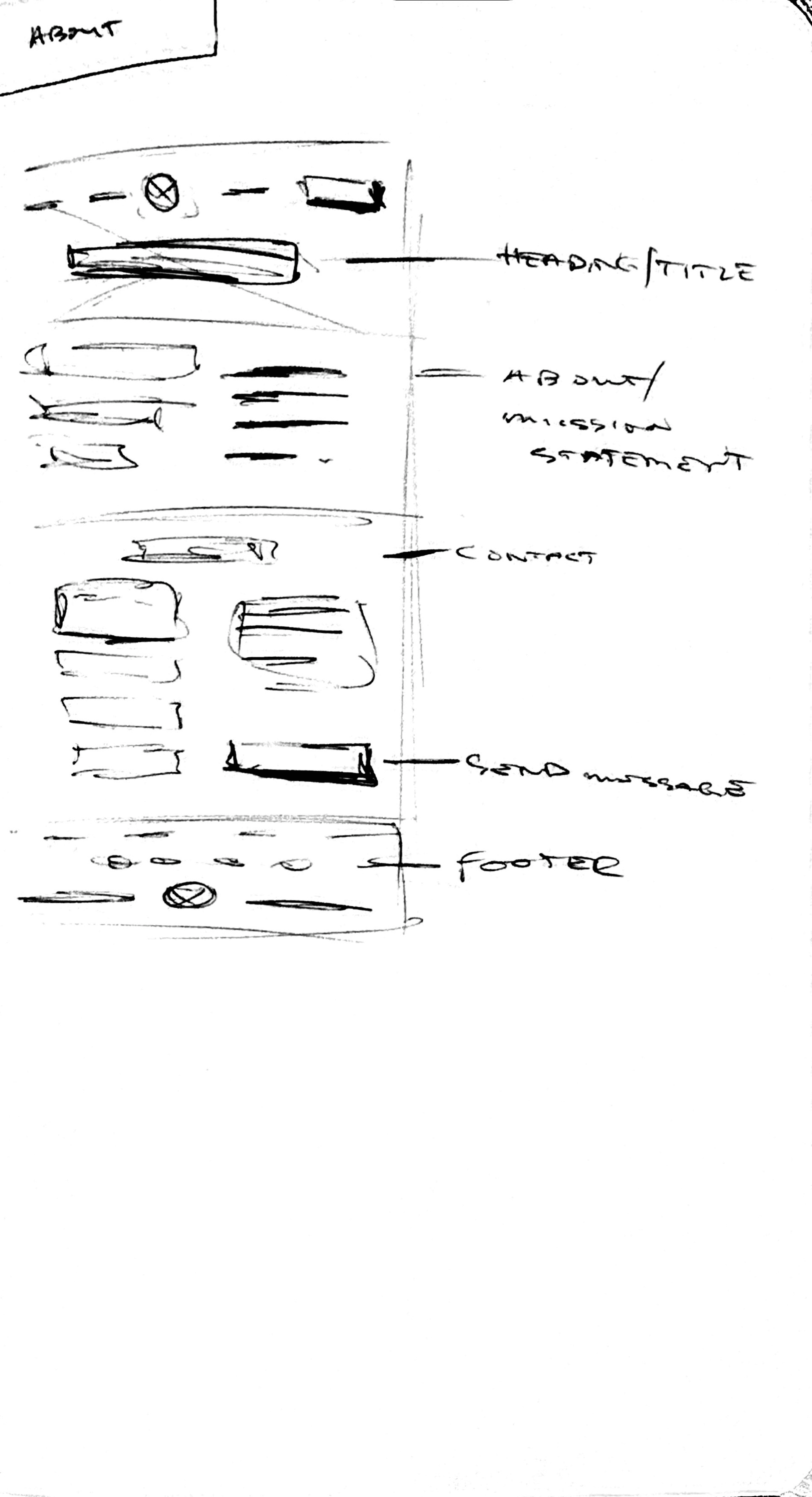
Originally the wireframes explored the vehicle details popping up in a modal. But, with so much to display and interact with on this screen, the details were eventually redesigned as their own standalone page.
Other Pages


A Quick Round of Testing
To confirm that the wireframes were in the state they needed to be before moving into rebranding, I gathered a few test participants to look through the wireframes and make sure the structure made sense. Participants had no issues scanning through the pages and found the new structure to be what they expect from a modern webpage.
Blending Mid-Century Vintage and Modery Luxury

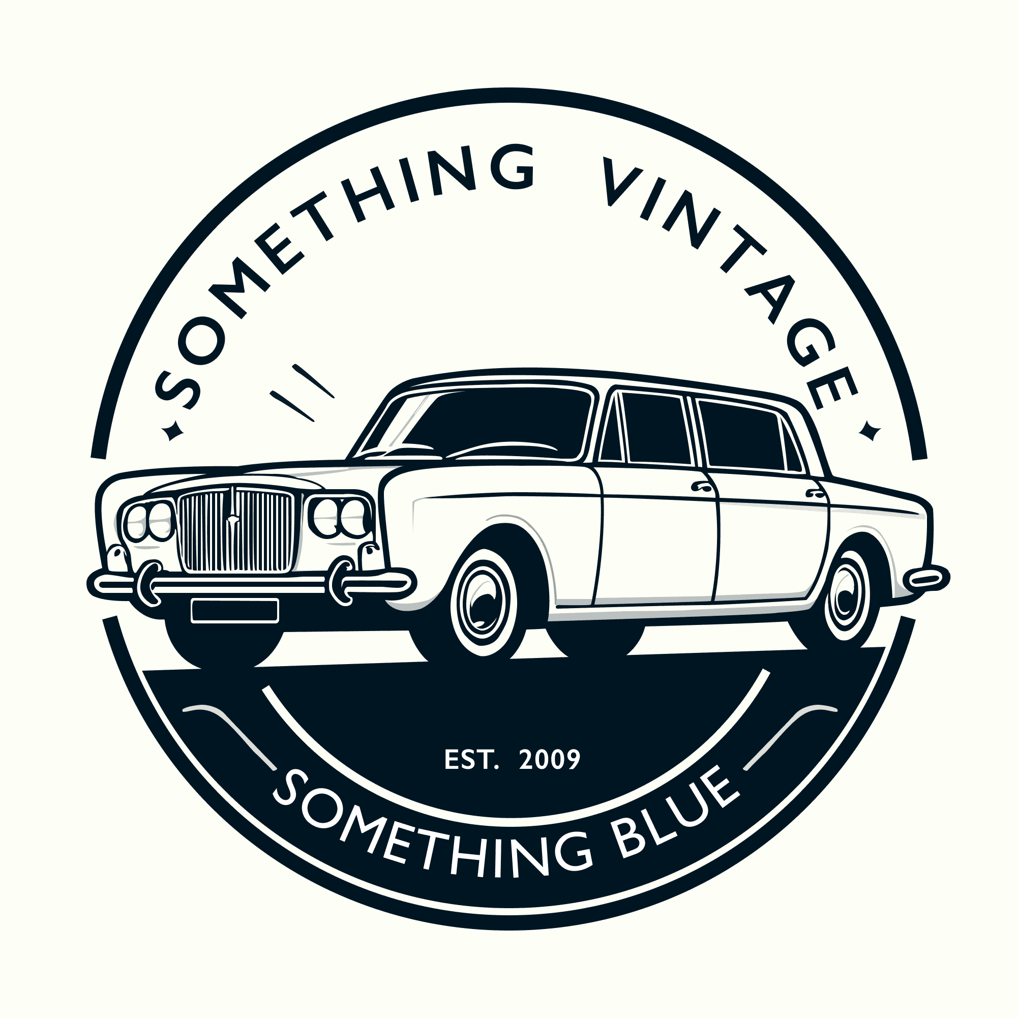
Creating the New Logo

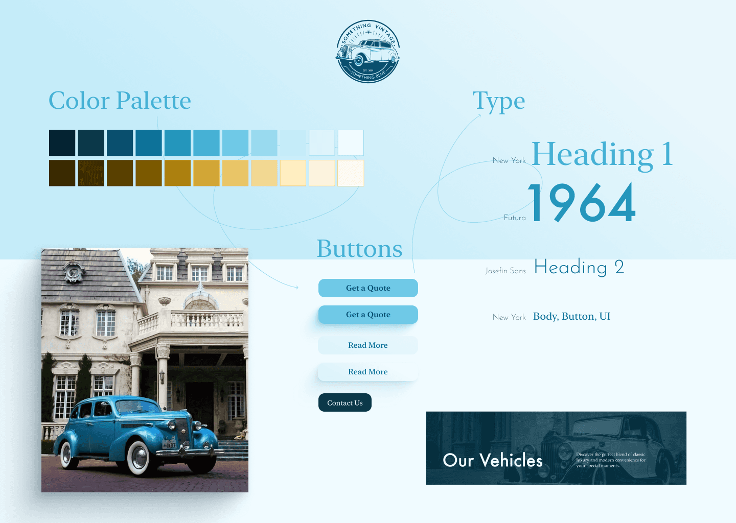
Building the Style
Again, the new design would be leaning more into the luxury vintage cars that are offered. So the color palette needed to offer soft pastels and a touch of gold. To modernize it, I played around with lighting to give depth to the design. Drawing inspiration from magazines and graphic design, I explored using large type to emphasize the details of the cars as well as the swirls to emphasize content, giving that print magazine-like feel.
Applying the Branding and Style to Polish the Final Design
With the style found, I started applying this into high-fidelity mockups, building a fully functional prototype with all of the necessary pages in Figma.
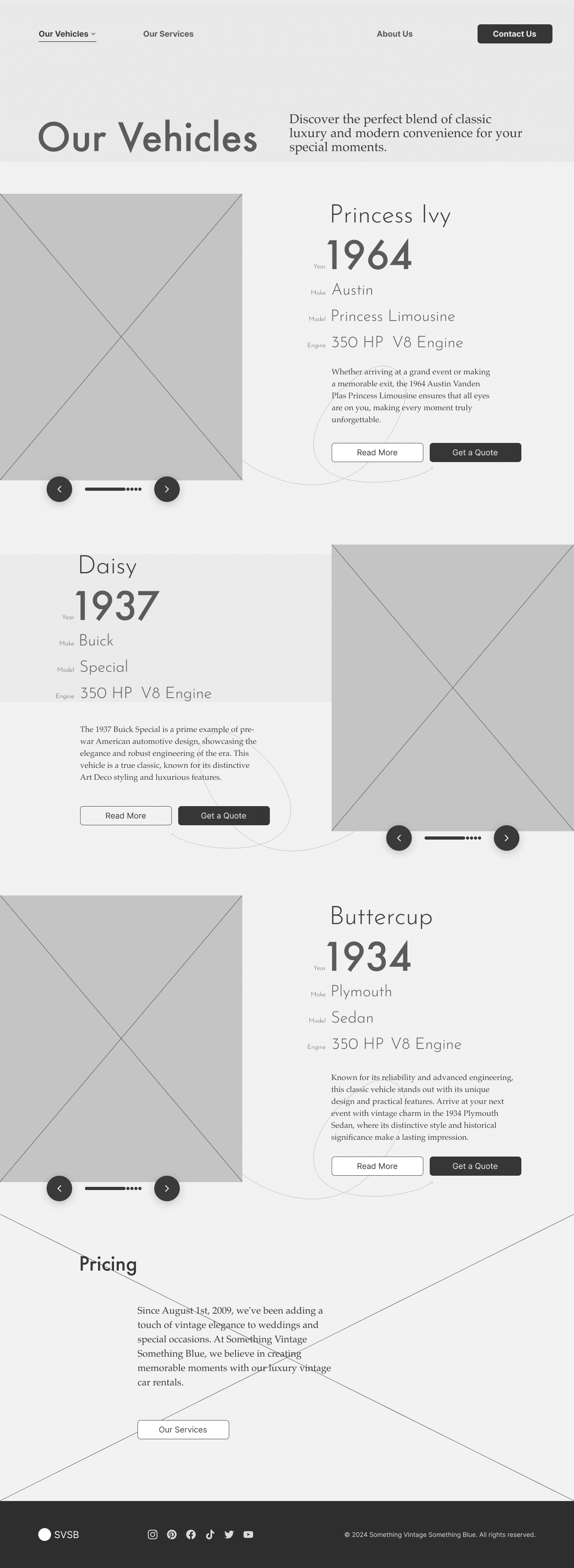
Landing Page
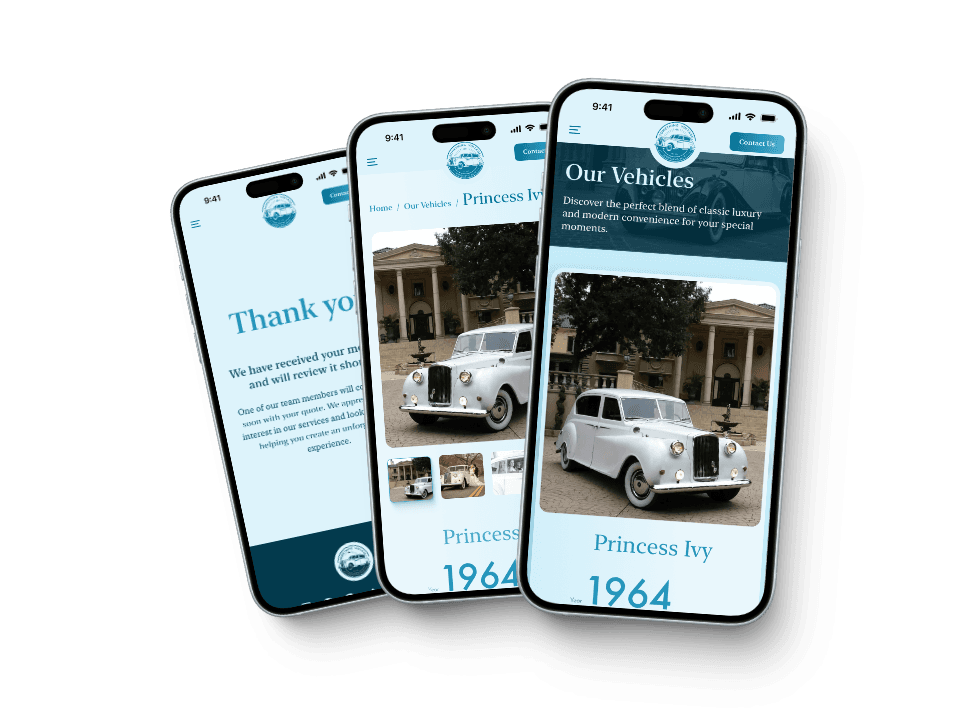
Vehicles Page


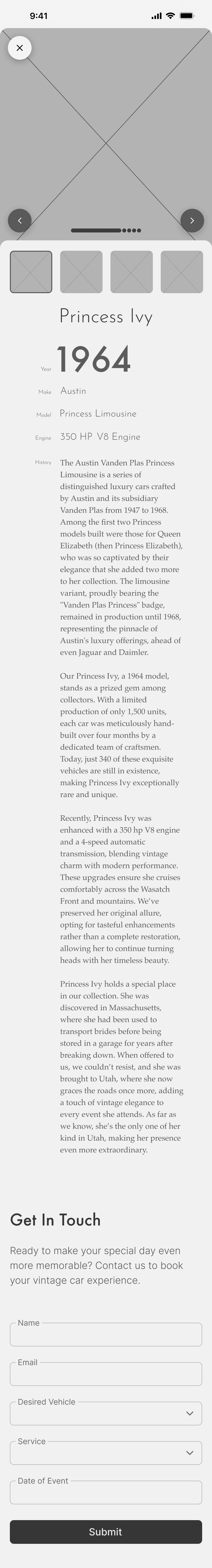
Vehicle Details
The new vehicle pages feature a large carousel at the top to showcase the beautiful imager SVSB has gathered over the years. As users scroll down they get magazine-details about the car they're viewing and its history.
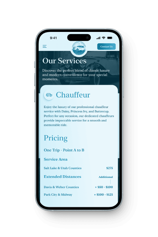
Our Services

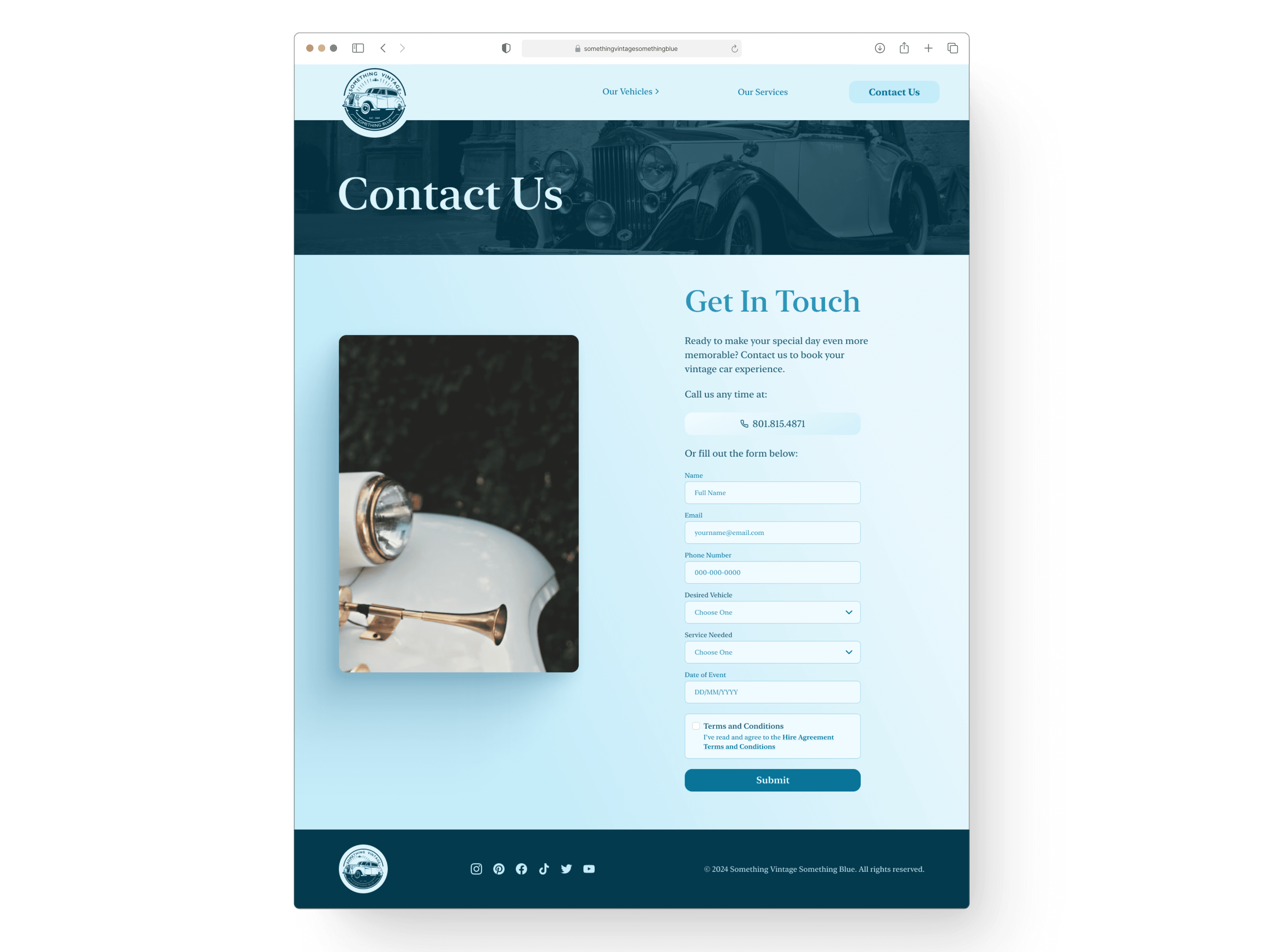
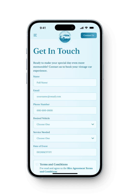
Contact Us
Unmonitored Testing Showed the Redesign Was a Success
To test the design I ran the same unmonitored user testing survey as before. The tests were a complete success with all participants glowing about the new design and ease of finding information. Many were excited to explore due to the beautiful visual design, finding themselves clicking through the vehicle photo carousels and more.
Participants were asked to describe their overall experience using the website and provide any general thoughts or suggestions for improvement. The feedback was overwhelmingly positive, emphasizing ease of use, professional look, and a luxurious feel.
The final user testing results indicate that the redesign of the SVSB website was highly successful in achieving its goals. The website now reflects a luxury service, is easy to navigate, and provides clear and comprehensive information on pricing and booking. The positive feedback from users validates the design decisions made during the project and highlights the effectiveness of the user-centered design approach.
The Final Experience
Browse Through the New Design
Because of the simple nature of the website, this prototype features every page of the redesign. Feel free to explore the new design.
Reflections
Having worked on my other UX/Product design projects, I was not as excited to work on a web design project like this. I found that it was rewarding to get to explore a little more creatively with the branding and design of this project. Local businesses can benefit so much from having even simple websites thoughtfully designed.
Key Takeaway
Finding Fulfillment in Simpler Projects
What I'm Proud Of
Future Improvements
While the project met its goals, one area for future improvement would be to fully implement an online booking system. Although the contact form was a practical compromise, integrating a comprehensive booking flow would further enhance the user experience and meet user expectations more fully.
I also wish I'd used another tool to design and prototype, one that I could actually build the functioning site with.
Final Thoughts
This project reaffirmed the importance of a user-centered design approach and iterative testing. It demonstrated that even simpler projects require careful consideration of user needs and business constraints. The confidence gained from this project has better prepared me for future freelance opportunities and reinforced my capability to tackle diverse design challenges.